Revealed: The 11 slides that finally convinced Boris Johnson about global warming
Multiple Authors
02.01.22Multiple Authors
01.02.2022 | 11:00pm科学新闻发布会上,英国首相鲍里斯Johnson says changed his mind about global warming has been made public for the first time, following a freedom-of-information (FOI) request by Carbon Brief.
Last year, on the eve of the UK hostingCOP26in Glasgow, Johnson described tackling climate change as the country’s “number one international priority”. He also published anet-zero strategyand told other countries at the UN General Assembly to “grow up” when it comes to global warming.
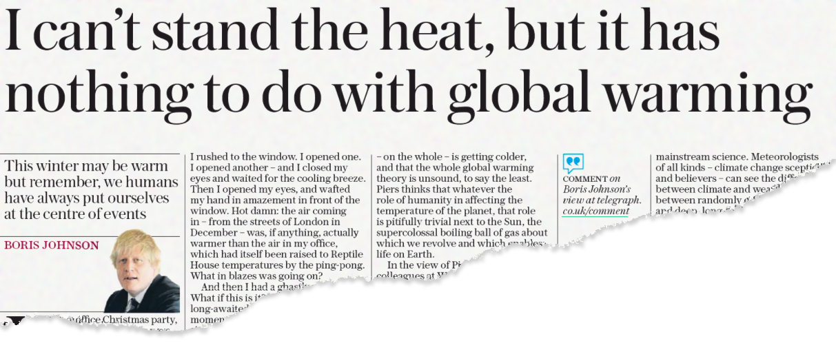
However, just a few years earlier, Johnson was publicly doubting established climate science. For example, in a Daily Telegraph column published in 2015 he claimed unusual winter heat had “nothing to do with global warming”. And, in 2013, he said he had an “open mind” to the idea that the Earth was heading for a mini ice-age.
Last year, acknowledging his past climate scepticism, Johnsontold journaliststhat he had now changed his mind, largely due to a scientific briefing he received shortly after becoming prime minister in 2019.
Johnson admitted he had been on a “road to Damascus” when it comes to climate science:
“I got them [government scientists] to run through it all and, if you look at the almost vertical kink upward in the temperature graph, the anthropogenic climate change, it’s very hard to dispute. That was a very important moment for me.”
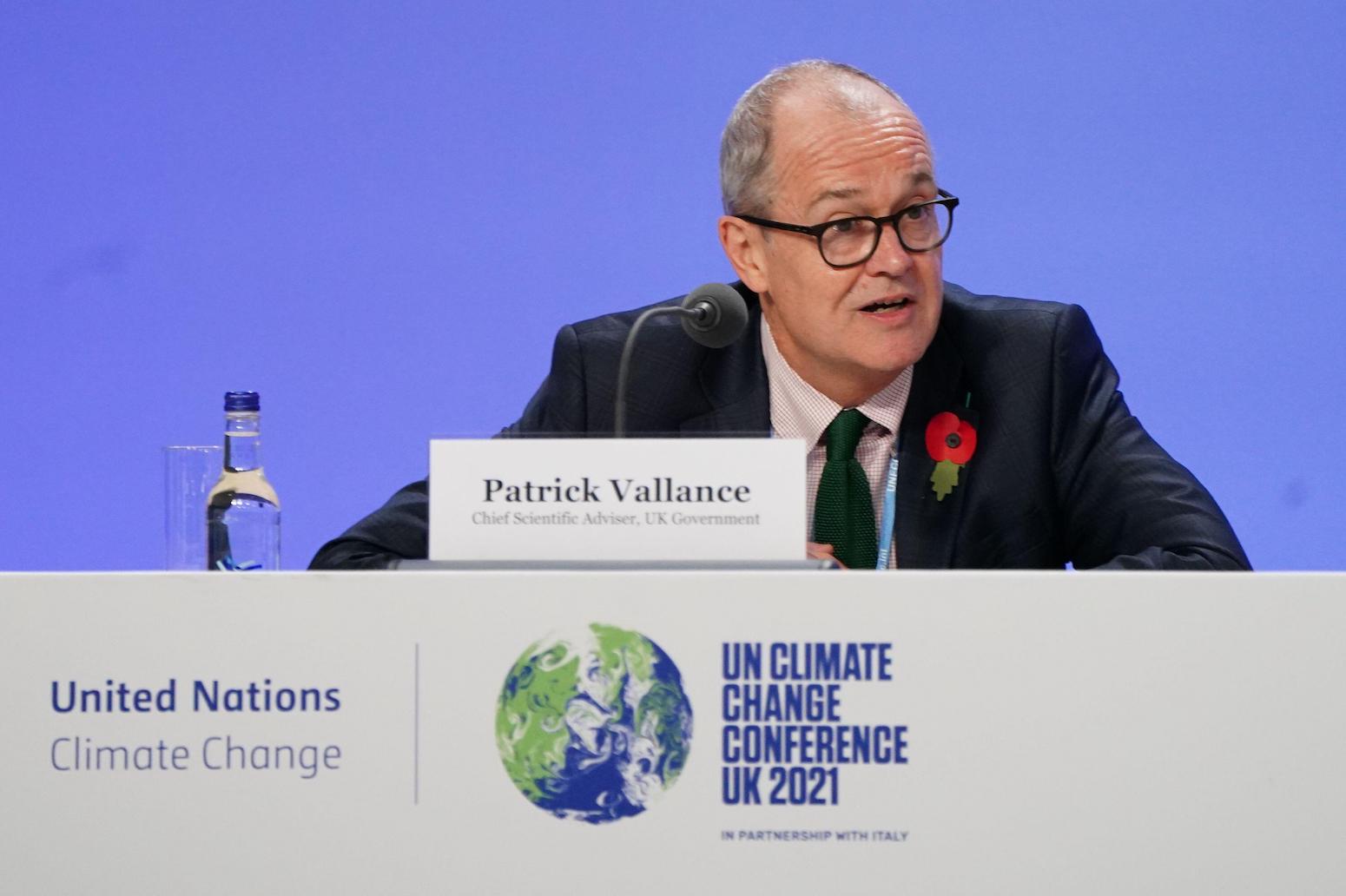
TheSunday Timeslater reported that this briefing had been given bySir Patrick Vallance,government’s chief scientific advisor, and, according to one of the prime minister’s close allies, it “had a huge impact”.
Using a FOI request submitted to the UK’sGovernment Office for Science(“GO-Science”), Carbon Brief has now obtained the contents of this pivotal scientific briefing, which took place on 28 January 2020 inside 10 Downing Street.
Below, Carbon Brief reveals the 11 slides that were used to “teach” Johnson about climate change, as well as the email correspondence exchanged between leading scientists and advisors as they prepared the prime minister’s briefing.
[Jump straight to see the 11 slides used in the presentation.]
The emails suggest that some No 10 advisors were suspicious of important aspects of climate science – for example, asking whether UN’s Intergovernmental Panel on Climate Change (IPCC)reportswere “worth taking note of”.
Email correspondence
The exchange of emails begins on 23 January 2020 when someone in the office of the government’schief scientific adviser, Sir Patrick Vallance, emails Met Office chief scientistProf Stephen BelcherandProf Gideon Henderson,chief scientific adviser at the Department of Environment, Food and Rural Affairs (Defra).
(See Carbon Brief’sin-depth interviewwith Belcher published in April 2018.)
The message describes plans for a climate change-themed “teach in” involving the two scientists which will be attended by a selection of No 10 staff, including some redacted names and “SpAds” (special advisors).Munira Mirzahas been the director of the “No10 policy unit”, which is referred to in the email, since Johnson became prime minister in 2019. (See the note at the end of the article about the reasoning given by GO-Science for redacting some names.)
Also copied into the email isDr Stuart Wainwright, who is the director of GO-Science and, therefore,works underVallance.
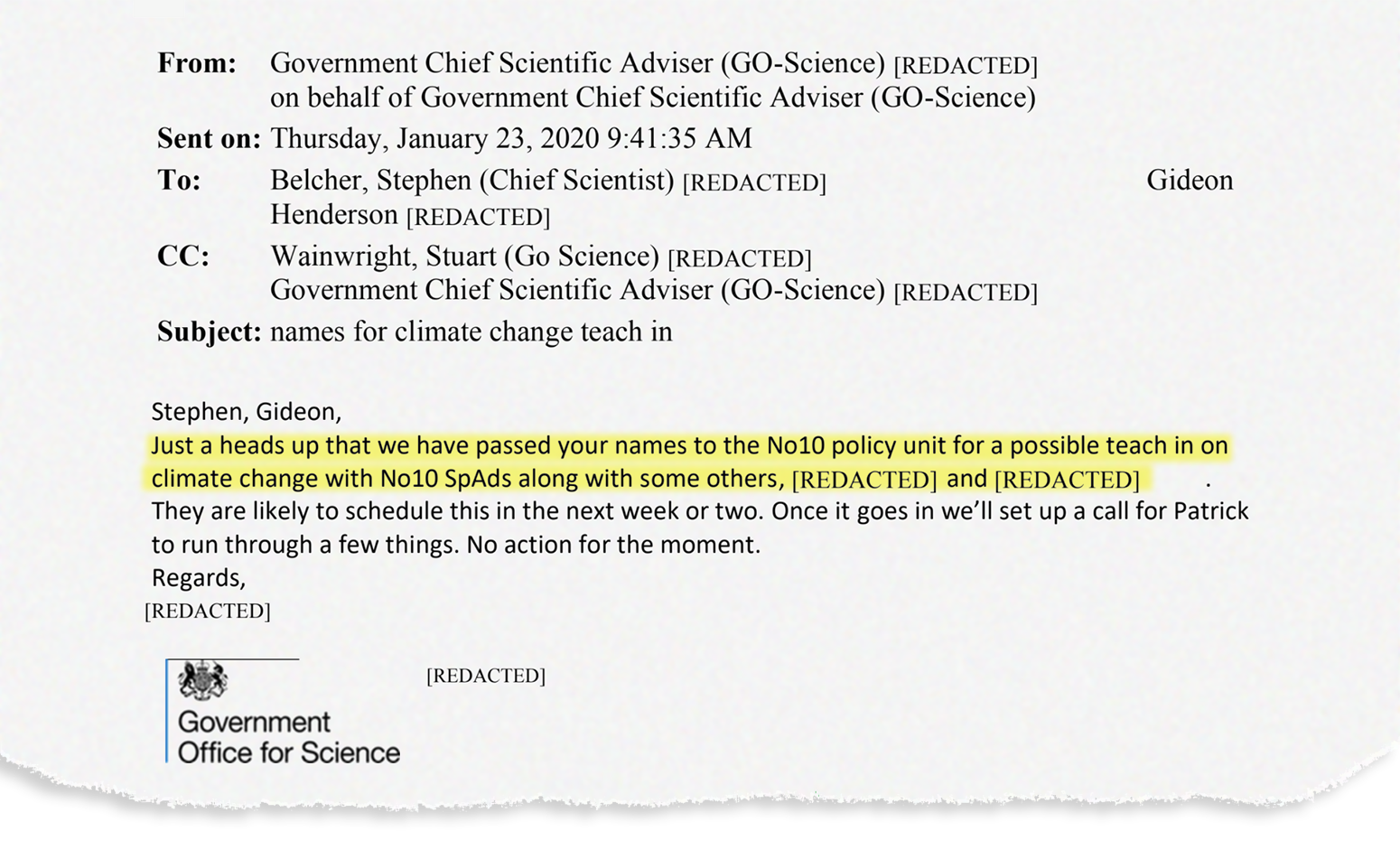
Henderson responds, noting that “we’ll need to prioritise this when we hear the time”.
The next day, an email is sent “on behalf of”Dominic Cummings,n the prime minister’s chief adviser, inviting the scientists to an event on 28 January in theCabinet Roomat No 10.
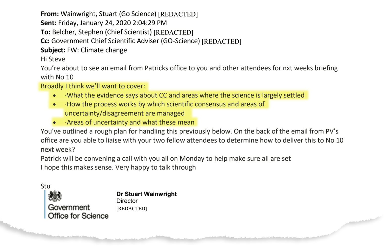
Shortly afterwards, Wainwright contacts Belcher outlining what they want to cover in the briefing. The plan focuses on what could be described as the basics of climate science, including evidence for human-caused climate change and the formation of scientific consensus. There is a notable focus on “uncertainty”.
This is followed by an email from Vallance’s office to a number of people, including Cummings, reiterating these three priority areas and indicating that Belcher has “previously discussed an idea of how to structure the session” with the chief scientific adviser.
They indicate that Belcher should “liaise with academic colleagues on pulling something together”, to which he replies: “Will do.” (The Met Office has confirmed to Carbon Brief that its senior climate scientistsProf Richard BettsandProf Peter Stottboth assisted Belcher in preparing for the briefing.)
An email from Wainwright follows explaining that the planned climate change session is “part of a broader set of teach in’s [sic] on various policy, economic, science aspects that will inform advice to the PM”.
At this point, Johnson had been in No 10 for six months, after taking over as Conservative leader in July 2019 andwinninga general election in December.
The next email is fromChris Pook, a deputy director in GO-Science working under Wainwright and Vallance.
He invitesRichard Barker, head of energy and environment atNational Physical Laboratory, to participate in the meeting as an expert, saying they need someone who can discuss uncertainty in climate measurements and help understand “what this means for decision-making”.
Two days later, on 26 January, Belcher emails the government scientists explaining that he has been working on a series of slides. Topics he mentions include the “need for quantitative advice oncarbon budgetsto achieve targets” and “current challenges” ontipping pointsandfuture impactsandextremes.
He also says they could discuss the concept of scientific peer review, theIntergovernmental Panel on Climate Change(IPCC) andBerkeley Earth, a US-based institution that analyses land temperature data, “as an example of a new group coming in as independent tests”.
Additionally, he suggests a selection of five experts who could contribute to the session. The names of all but one –Baroness Brown, chair of theClimate Change Committee’s(CCC) adaptation committee – are redacted. One is proposed with the caveat that “she has done lots of media work, quite campaigning”. Another is described as an “excellent communicator on impacts”. A further suggestion comes with the remark: “I appreciate Stuart you thought she might appear too close? She is excellent.”
On 27 January, the day before the meeting, Vallance’s office contacts Belcher confirming that Barker and another individual whose name has been redacted will be invited to the event. They mention that they have been delayed due to “trying to juggle the response to Wuhan coronavirus”. (The first cases of Covid-19 in the UK wereconfirmed四天之后)。
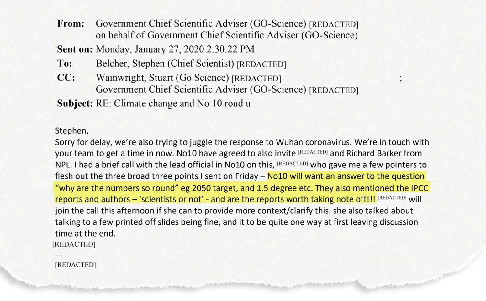
This email builds on the three priority areas previously mentioned, adding some more specific questions that No 10 would like the experts to address. These questions indicate a degree of scepticism about some of the key processes underlying climate science:
“No10 will want an answer to the question ‘why are the numbers so round’ eg 2050 target, and 1.5 degree etc. They also mentioned the IPCC reports and authors – ‘scientists or not’ – and are the reports worth taking note off!!! [sic]”
The “2050 target” likely refers to the UK’s legally binding goal for achieving net-zero emissions by 2050,established在最后几天约翰逊的prede办公室cessor, Theresa May. The mention of “1.5 degree” references theParis Agreement’sstretch goal of limiting warming to 1.5C, which scientists think would limitsome ofthe worst impacts of climate change.
TheIPCCis a UN body that is regarded internationally as the authority on climate change. Its landmark assessment reports, assembled by hundreds of leading scientists every seven years or so, present comprehensive overviews of the state of knowledge on the topic.
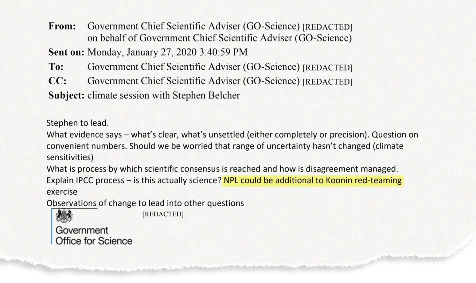
This email is followed later that day by an internal message between GO-Science staff indicating that Belcher will lead the session and reiterating some key points from the session plan.
Again, this message highlights a focus on “what’s clear, what’s unsettled”, how scientific consensus is reached, “convenient numbers” and whether the IPCC process is “actually science”.
It also asks: “…should we be worried that [the] range of uncertainty hasn’t changed (climate sensitivities)?” This references the point that estimates of气候敏感性– a measure of how much the planet is expected to warm in response to rising CO2 levels – had not been narrowed for decades. While this is no longer the case followingnew researchcaptured in last year’sIPCC sixth assessment report(AR6), this information had not yet been published at the time.
The final line of the email mentions a “Koonin red-teaming exercise” – presumably a reference toDr Steven Koonin, a US physicist who has worked for both BP and the Obama administration, and who has more recentlybeen accusedofdownplaying the severityof climate change.
During the years of the Trump administration in the US, Kooninadvocatedfor a “red team” methodology to “test assumptions and analyses, identify risks, and reduce – or at least understand – uncertainties” around climate science. The approach saw some support within the Trump administration, butwas dismissedby other scientists as inappropriate for assessing climate science. No such exercise ever ended up taking place.
It is notable that Dominic Cummings has also been aprominent supporterof the “red-team” approach in various fields as a means of combating what he describes as “groupthink and normal cognitive biases”. (Carbon Brief has approached Cummings for comment, but, upon publication, had not received a response.)
As the meeting approaches, the participants arrange a 45-minute “pre-meet” before heading to No 10. At this point, Belcher, Henderson, Vallance and Barker are listed as attending the meeting, along with one more redacted name. Another redacted name is unable to come as “she is in France”.
On the morning of 28 January, Belcher sends over his slides – which he describes as “reasonably vanilla” – to “guide discussion later today”. Among other things, he emphasises that the “goal is to stabilise climate, which requires net-zero emissions”. He asks for feedback from the others.
Henderson responds with some last-minute changes to the presentation. He notes that it largely misses out impacts of sea-level rise, including on the UK and its flood defences, something that is “perhaps more important than arctic [sic] sea ice for HMG [the government]”.
He adds that, “personally, I would put more focus on C cycle [carbon cycle] as cause of problem, important feedbacks, and the bit we need to act on”.
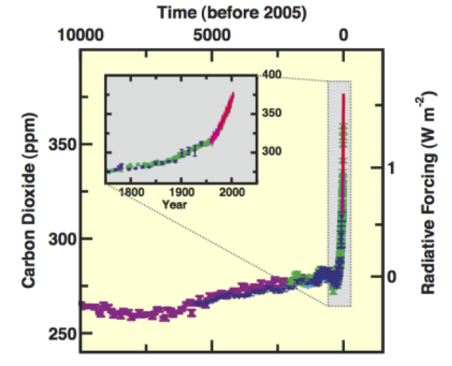
There is another, lengthy, response to Belcher from a redacted email address. It suggests adding a chart showing the long-term record of carbon dioxide (CO2), as well as various climate impacts taken from the IPCC, including huge losses for coral reefs, impacts on crop production and increased spread of various diseases. The writer stresses that “it may be worth pointing out that to achieve 1.5C (and perhaps 2C) requiresnet *negative* emissions”.
They also attach the chart below as an example of one that could be added to the presentation, noting that a “striking thing to show” would be “the long-term record of CO2”. They note that they cannot find a suitable chart from the IPCC’sfifth assessment report(AR5), published in 2013, and so include one from thefourth assessment(AR4), from 2007. The emailer notes that “it’s out of date, of course – CO2 is now up to 400 ppm [parts per million]”.
The chart, or a more recent version of it, does not make it into the final presentation.
Barker also responds to Belcher’s call for suggestions with a “rather basic question” around the conclusion they want to present to No 10:
“My assumption is that we want this meeting to establish the big opportunity for us to take a big step forward.”
While Belcher says he will leave Vallance to “comment on the overall purpose of the meeting”, there is no email from the chief scientific adviser clarifying this point in the released documents. His office does note again at this point that they are “currently quite immersed in coronavirus”.
Finally, as the meeting approaches, the final slides are sent out to GO-Science with a request for 15 hard copies to be printed, possibly indicating the final number of attendees at the event.
(Carbon Brief has learned that Boris Johnson received at least one further science briefing on climate change following this January 2020 presentation. In March 2021, for example, he was specifically briefed about, among other topics, the projected climate impacts at 2C and 4C of global warming. The information about these impacts was prepared by Prof Richard Betts from the Met Office and theUniversity of Exeterusing findings from the EU-fundedHELIX project. Prof Betts also provided UK examples from the Technical Report of the Third UK Climate Change Risk Assessment, often known asCCRA3. Carbon Brief also understands that, even though Sir Patrick Vallance led the briefing at No 10 Downing Street on 28 January 2020, the 11 slides themselves were presented by Prof Belcher.)
Science slides
Below, with explanation by Carbon Brief, are the 11 slides shown to the prime minister on the evening of 28 January 2020 in the Cabinet Room at No 10 Downing Street.

Slide 1
The three charts come from theMet Office Hadley Centre’sClimate Dashboard– a website that brings together “the key indicators of climate change”. The site features graphs such as temperature change, sea level change and atmospheric CO2 change over time – drawing on data produced by “respected institutes and research groups around the world”.
The graph in the top left is known as aKeeling Curve, and shows the increase in atmospheric CO2 levels over 1960-2020, measured in parts per million. The graph uses data from three sources – the Mauna Loa observation centre (blue), theNational Oceanic and Atmospheric Administration(yellow) and the World Data Centre for Greenhouse Gases (red).
The graph in the bottom left shows the increase in global temperatures over 1850-2020, compared to the 1850-1900 average. The coloured lines indicate different datasets, including the Met OfficeHadCRUT(black) and the National Oceanic and Atmospheric AdministrationNOAAGlobalTemp(yellow).
The graph in the bottom right shows global sea level from 1993 to 2020, compared to the 1993-2010 average, in mm. The graph uses satellite datasets from organisations including theCommonwealth Scientific and Industrial Research Organisation(pink) and theNational Aeronautics and Space Administration(light blue).
The map in the top right shows warming over 2009-19, compared to the 1961-90 average. The graph is similar in appearance to one used on theMet Office HadObs website.

Slide 2
The two charts on the left are fromFAQ 10.1 in chapter 10of the Working Group I report of theIntergovernmental Panel on Climate Change’s (IPCC)fifth assessment report(AR5), published in 2013. This chapter focuses on “detection and attribution” of climate change.
黑色线条显示观察全球的脾气ature since 1860, based on datasets including the Met Office HadCRUT4 dataset, while the red and blue lines show model results. The upper chart shows model simulations excluding the influence of human activity on global temperature results. Conversely, models in the lower chart include human influence on global temperatures. While the upper chart shows a clear departure between model runs and observations from the 1960s, the lower chart shows close agreement between the models and observations. This shows how “human forcing”plays a key role in observed temperature trends.
The map in the top right is a repeat of the one shown in the first slide. The map below it shows the equivalent data from climate model output (taken as an average across a number of models).

Slide 3
The large graphic was produced by the Met Office’s “Knowledge Integration” team – a group responsible for communicating climate science produced at the Met Office Hadley Centre to the general public and government. The map compares Arctic sea ice extent in 1980 and 2019. Meanwhile, the text states that over this time, September Arctic sea ice extent declined by 12% on average – resulting in an overall loss of almost 3.5m km2.
The smaller insert is from the Met OfficeClimate Dashboard, and shows the decline in Arctic sea ice over 1980-2019, compared to the 1981-2020 average. The plot uses datasets from theCopernicus Climate Change Service,Ocean and Sea Ice Satellite Application Facilityand theNational Snow and Ice Data Center.
The slide is titled “a tipping point”, but as a scientist in the email chain (with their name redacted) points out, the decline in Arctic sea ice is not strictly a tipping point. They write: “To me, that means sudden rapid change (through some unstable feedback) or irreversibility. There isn’t evidence for the former, as far as I know, and there are model studies that show that sea-ice comes back if you cool down the climate, so it’s not an irreversibility like ice-sheet loss could be.” For more on this, see the final section of亚慱官网’s tipping points explainer.

Slide 4
These figures were produced using theHadEX3 dataset. This dataset uses daily observations of both variables, taken at thousands of locations across the globe over 1901-2018, to produce “indices” of extreme temperature and precipitation.
The figures on the left show the change in extreme temperatures over 1950-2018. The top left map shows the regional pattern – where red indicates an increase in temperature extremes, blue indicates a decrease and grey denotes areas in which there was no data. The line plot below shows the number of days per year, over 1901-2018, that the global average temperature crossed a given threshold. The line plot compares the more recent dataset (HadEX3, black) with similar, older datasets.
The figures on the right use the same format for changes in extreme rainfall. The map shows the change in extreme rainfall over 1950-2018, where blue indicates an increase in rainfall extremes and brown indicates a decrease. The line plot shows the number of days per year global rainfall crossed a given threshold, for each year between 1901-2018.
The graphics show that while temperature extremes have increased across the globe since the 1970s, the signal for rainfall is less clear.

Slide 5
This slide features a range of images, maps and graphics showing the impacts of climate change. These are grouped under four subheadings – “flooding and sea level rise”, “heatwaves, health and disease”, “wildfires” and “biodiversity”.
For example, the blue graphic in the “flooding and sea level rise” category states that in the UK, “extended periods of extreme winter rainfall are now seven times more likely”. The graphic has previously been displayed on a section of the Met Office websitedetailing the impacts of climate change, both in the UK and globally. These pages have since been restructured.

Slide 6
Thisfigurecomes from the IPCC AR5synthesis report, published in 2014. It shows the relationship between accumulating atmospheric CO2, rising global temperatures and climate change risks. (Moreup-to-date versionsare available in the IPCC’sspecial report on 1.5C, published in 2018.)
Panel a) illustrates the five “Reasons For Concern” – also known as a “burning embers” chart – which summarise five key categories of risk around climate change. The colour of the shading – from white to purple – indicates an increasing level of risk with higher levels of warming.
Panel b) shows the relationship between cumulative CO2 emissions and global average surface temperature increase. The ellipses show expected total human-caused warming in 2100 expected from each level of cumulative emissions, plotted as a function of that total from 1870 to 2100. The filled black ellipses show observed emissions to 2005 and observed temperatures in the decade 2000-09, and the equivalent for 2017. The latter appears to have been added retrospectively to the IPCC chart for this presentation.

Slide 7
According to the credit on the image, this figure was created byDr Erich Fischer, a senior scientist and lecturer in the部门Environmental Systems ScienceatETH Zurich. It was created using theEarth System Model Evaluation Tool(ESMValTool), which “allows for routine comparison of single or multiple models, either against predecessor versions or against observations”.
The figure shows observations (black lines) and climate model projections (coloured lines) of global average surface temperature change from 1850 to 2100. The left-hand chart shows the projections from thesixth Coupled Model Intercomparison Project(CMIP6) under fiveShared Socioeconomic Pathways(SSPs). The right-hand chart shows the equivalent projections from CMIP5 using theRepresentative Concentration Pathways– the predecessors to CMIP6 and the SSPs, respectively. The right-hand chart has been flipped to allow a direct comparison between the two. The shading indicates the range in the projections under each scenario.

Slide 8
The figure on the left is a repeat of the sea level rise chart shown in the first slide.
The figure on the right is taken from theUK Climate Projections 2018(UKCP18), produced by the Met Office. The charts on the left show UK average sea level rise from 2000 to 2100 under a scenario that likely keeps warming below 2C by 2100 (RCP2.6) and a scenario of very high global emissions (RCP8.5). The solid line and shaded regions represent the central estimate and ranges for each scenario, while the dashed lines indicate the overall range across RCP scenarios. The maps on the right show projected sea level rise in 2100 around the UK coastline under the central estimate of each RCP. Theoriginal figure(pdf) also includes an intermediateRCP4.5scenario. All data are relative to a baseline period of 1981-2000.

Slide 9
This chart shows theMet Office decadal forecastfor global temperatures, issued in January 2021. The forecast suggests that annual global average temperatures during 2021-25 are very likely to be between 0.91C and 1.61C above pre-industrial levels. In the chart, the black lines show observed data (from the Met Office,NASAandNOAA), the blue shading shows the latest prediction, and the red shading shows previous predictions at five-year intervals starting from November 1960 and through to 2010. In addition, 22 model simulations from CMIP5 – that have not been initialised with observations – are shown in green. In all cases, the data is shown as rolling 12-month averages and the shading represents the probable range, such that the observations are expected to lie within the shading 90% of the time.

Slide 10
This figure was produced byClimate Action Tracker(CAT), an independent group that tracks government climate action towards theParis Agreementgoals. The chart was part of itsDecember 2019 global update(pdf), although it does not appear to still be on the CAT website (there have been a number of updates since). The same chart is referenced in a June 2020 article byS&P Global.
The chart shows the expected global temperature increase by the end of the century compared to pre-industrial levels implied by global emissions pathways in six scenarios: Baseline emissions, emissions compatible with warming of 1.5C and 2C, respectively, and the three scenarios resulting from aggregation of 32 country assessments: Pledges & targets, Current policies and an optimistic scenario. The shaded ranges indicate uncertainty in emissions projections and the dotted lines indicate median (50%) levels.

Slide 11
This table identifies a number of climate “tipping points” – thresholds beyond which a system can be pushed into a completely new state – and their potential impacts globally and for the UK. The table divides tipping points into three categories: the carbon cycle and other biogeochemical cycles, the cryosphere and sea level, and ocean/atmosphere circulation. The source of the table is not clear, though it could have been created specifically for the presentation.
All 38 emails released under theFreedom of Information Act 2000by GO-Science to Carbon Brief can be viewed as aPDF. An earlier version of the presentation, which was discussed and shared in the emails, can also be viewed as aPDF, as well as the final version shown to the prime minister, also available as aPDF.
In responding to Carbon Brief’s FOI request, GO-Science provided the following explanation for why it delayed the release for more than a month to conduct a “public interest” test, as well as why some names in the emails were redacted:
“The requested information engagedSection 35(1)(a)——制定管理相关的信息ment policy; because of this we have carried out a public interest test. In this instance the information is in relation to factual background information and scientific consensus on climate science, provided to inform policy decisions regarding climate change. There is a high public interest in climate change-related policies, which have and will have a significant impact on the public. Given the public interest in transparency regarding the scientific information provided to government in this context, we have determined that it is in the public interest to disclose the information held, and we have not applied this exemption. We are refusing some of this information (redacted in the annexes) under:Section 40(2)——个人信息。我们有保留个人information if disclosure would breach one or more of the principles of theUK General Data Protection Regulation(UK GDPR) orData Protection Act 2018.
Carbon Brief also submitted an FOI request to theCabinet Officeasking for the same information about the 28 January 2020 briefing, but it responded – inaccurately, as GO-Science’s release of files proves – saying: “Searches of our records have not identified any information in scope of your request under the Act.”
-
Revealed: The 11 slides that finally convinced Boris Johnson about global warming