IPCC: How the AR6 WG1 summary for policymakers compares to its predecessor
Robert McSweeney
08.12.21Robert McSweeney
12.08.2021 | 5:51pmThelatest assessmentof climate science from theIntergovernmental Panel on Climate Change(IPCC) is a heavyweight report in more ways than one.
More than 200 authors from around the world have spent the past three years drafting and redrafting over 3,000 pages of the full report. Released on Monday, the findings from the first installment of the sixth assessment report (AR6) – known asWorking Group 1(WG1), which focuses on the “physical science basis” – have madeheadline newsaround the world and drawn responses fromglobal political figures.
-
WG1
- In-depth Q&A: The IPCC’s sixth assessment report on climate science
- Scientists react: What are the key new insights from the IPCC’s WG1 report? WG2
- In-depth Q&A: The IPCC’s sixth assessment on how climate change impacts the world
- Scientists react: What are the key new insights from the IPCC’s WG2 report? WG3
- In-depth Q&A: The IPCC’s sixth assessment on how to tackle climate change
- Scientists react: What are the key new insights from the IPCC’s WG3 report?
Much of the reaction refers to the report’s most accessible and most high-profile element – the summary for policymakers (SPM).
As its name suggests, the SPM is a non-technical synopsis of the report’s key findings. It boils the full report down into around 40 pages, which are then approved line-by-line by government delegates representing almost 200 nations around the world.
It is eight years since the IPCC’sfifth assessmentof climate science (“AR5”). Therefore, the new report benefits from almost a decade’s worth of additional research, observations and technological progress.
So, how does the SPM of AR6 compare to AR5? What have been the principal changes and updates?
In the tables below, Carbon Brief has pulled out the key statements – where directly comparable – from the WG1 SPMs of the two assessment reports, as well as those of the three special reports that the IPCC published during the AR6 cycle – on1.5C of warming(“SR15”; published in 2018),land(“SRCCL”; 2019), and theocean and cryosphere(“SROCC”; 2019).
Evolving style
The comparison is divided into two separate tables, broadly covering observations and projections. The AR5 statements are included in the left-most pair of columns and the AR6 statements on the right. Statements from the special reports, which were published between the two assessment reports, are shown in the middle (and can be toggled on/off).
-
WG1
- Media reaction: IPCC’s new climate science report and what it means for the world
- Analysis: What the new IPCC report says about when world may pass 1.5C and 2C
- Explainer: What the new IPCC report says about extreme weather and climate change
- IPCC: How the AR6 WG1 summary for policymakers compares to its predecessor WG3
- Analysis: What the new IPCC report says about how to limit warming to 1.5C or 2C
- Guest post: How not to interpret the emissions scenarios in the IPCC report
- Guest post: Why estimates of the ‘cost’ of climate action are overly pessimistic
It is important to note that not all the statements from all the reports are included in the table – it is limited to those that are comparable between AR5 and AR6. Likewise, if there are comparisons between the two assessment reports where there is not an equivalent statement from one of the special reports, these cells are left blank.
For example, while the AR6 WG1 SPM mentionsmarine heatwaves– noting, withhigh confidence, that “with additional global warming, the frequency of marine heatwaves will continue to increase” – they do not get a mention in the AR5’s summary. It is, therefore, not included in the table.
It is also worth noting that there is a difference in style between the two assessment report SPMs. Since AR5 was published, there has been “a lot more thought on the intent,narrativeand audience” of the SPMs, saysPiers Forster教授, a climate scientist at theUniversity of Leeds, a drafting author of the latest SPM and an author on AR6, as well as many previous IPCC reports.
He tells Carbon Brief that the process behind the AR6 summary “was far more bottom up and iterative” than for previous IPCC reports, noting that “it was a lot more work, but we wrote and rewrote it many times”. He adds that “we couldn’t add many numbers as we did not want it to be too long, so this meant we had to integrate findings”. This perhaps explains why AR6’s summary is more descriptive, while AR5’s has more focus on raw numbers.
Throughout the tables, and this article, any statements in the IPCC’s “calibrated language”, which indicates the level of certainty or confidence in a finding, are shown in italics. This set of terms are shown below. And key figures are underlined to make them easier to spot.
Finally, the tables frequently mention the emissions scenarios that feed into the projections – the “Representative Concentration Pathways” (RCPs) and their successors, the “Shared Socioeconomic Pathways” (SSPs). These are explained by Carbon Brief in more detailhere.
| Table 1. Likelihood Scale | |
|---|---|
| Term* | Likelihood of the Outcome |
| Virtually certain | 99-100% probability |
| Very likely | 90-100% probability |
| Likely | 66-100% probability |
| About as likely as not | 33-66% probability |
| Unlikely | 0-33% probability |
| Very unlikely | 0-10% probability |
| Exceptionally unlikely | 0-1% probability |
Observations
Perhaps the most prominent change between the two reports is the headline statement on the human influence on observed global warming.
AR5 found that it wasextremely likelythat “human influence has been the dominant cause of the observed warming since the mid-20th century”. According to the IPCC’s calibrated language, this means that scientists were between 95% and 100% sure that humans were warming the planet. For AR6, the authors conclude that it is “unequivocal that human influence has warmed the atmosphere, ocean and land”.
As IPCC authorProf Ed Hawkinsfrom theUniversity of Readingtold a press briefing:
“So it is a statement of fact, we cannot be any more certain; it is unequivocal and indisputable that humans are warming the planet…And every government agreed to that [wording in the SPM].”
Asummaryof the approval session by theEarth Negotiations Bulletin(ENB) – an independent reporting service on UN environment and development negotiations – notes that delegates from Luxembourg proposed the “unequivocal” language, which was then “supported by the Netherlands, France, the UK, Saint Kitts and Nevis, Jamaica, Ireland, and others”, but opposed by “Saudi Arabia, China and India”. The ENB adds:
“After some discussion, Saudi Arabia accepted the compromise formulation with a small editorial change and the headline statement was approved.”
Looking further back to SPMs from earlier IPCC assessment reports, it is interesting to see how the language around human influence has evolved:
- First assessment report(1990): By increasing their concentrations, and by adding new greenhouse gases like chlorofluorocarbons (CFCs), humankind is capable of raising the global-average annual-mean surface-air temperature.”
- Second assessment report(1995): “The balance of evidence suggests a discernible human influence on global climate.”
- Third assessment report(2001): “Most of the observed warming over the last 50 years islikelyto have been due to the increase in greenhouse gas concentrations.”
- Fourth assessment report(2007): “Most of the observed increase in global average temperatures since the mid-20th century isvery likelydue to the observed increase in anthropogenic greenhouse gas concentrations.”
- Fifth assessment report(2013): “It isextremely likelythat human influence has been the dominant cause of the observed warming since the mid-20th century.”
- Sixth assessment report(2021): “It is unequivocal that human influence has warmed the atmosphere, ocean and land.”
不出所料,观察全球温度的数量erature rise has also changed. At the time of AR5, scientists estimated that the most recent decade (2003-12) was 0.78C warmer than 1850-1900. In contrast, AR6 finds that 2011-20 was 1.09C warmer than 1850-1900.
全球气温增长”principally” due to eight years of additional warming, the AR6 SPM says, amounting to 0.19C of the higher estimate. However, it is also down to updates to the underlying datasets, an AR6 SPM footnote explains:
“既然AR5,方法论的进步和新的datasets have provided a more complete spatial representation of changes in surface temperature, including in the Arctic. These and other improvements have additionally increased the estimate of global surface temperature change by approximately 0.1C, but this increase does not represent additional physical warming since the AR5.”
(See亚慱官网’s in-depth Q&A on the full report for more details.)
The IPCC is also more certain about other aspects of observed change. For example, AR5 found that humans werelikelyhaving an impact on the increased surface melt of theGreenland ice sheet. This has been upgraded tovery likelyin AR6.
This increase in certainty “is based on a better understanding of the factors that drive surface melt and surface mass balance changes”, explains climate scientistDr Ruth Mottramof theDanish Meteorological Institute.
She tells Carbon Brief that “melting has undoubtedly increased in the last two decades in Greenland”. Mottram adds that “there have been several studies that show the atmospheric signal of a warming climate explains most of the observed melt”.
There are some aspects of climate science that still lack certainty, of course, and one of these is around changes in Antarctic sea ice. At the time of AR5, Antarctica had seen gradual increases in sea ice extent over much of the satellite record (1979 to present).
However, the authors noted that there waslow confidencearound the drivers of these changes “due to the incomplete and competing scientific explanations for the causes of change andlow confidencein estimates of natural internal variability in that region”.
In the period since, the Antarctic has seen a dramatic fall in sea ice cover, followed by a partial recovery. (See a recent亚慱官网guest post for more discussion.) As a result, both the SROCC and AR6 concluded that there was “no significant trend” in Antarctic sea ice extent over recent decades.
Projections
In addition to advances relating to observed changes in the climate, the years since AR5 have seendevelopments in climate modelsand research into future warming and its impacts.
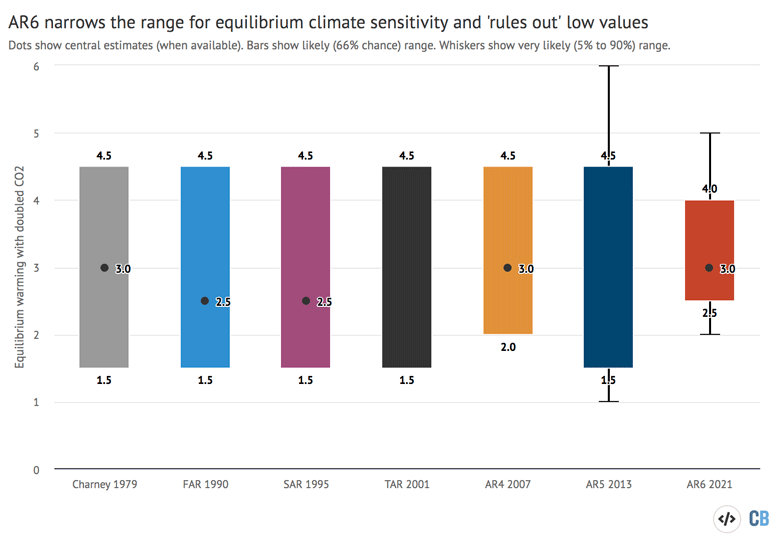
For example, one of the most significant in AR6 is the narrowing of the range for “equilibrium climate sensitivity” (ECS) – a key climate metric showing how much the world is expected to warm if CO2 levels double compared topre-industrial levels.
The AR5 SPM said that ECS was “likelyin the range 1.5C to 4.5C”, adding that it wasextremely unlikelyto be less than 1C andvery unlikelyto be greater than 6C.
In contrast, the AR6likelyrange is given as 2.5C to 4C, which also provides a “best estimate” of 3C – something not given in AR5. The tighter range broadly reflects the findings of amajor study, published in 2020.
As IPCC authorProf Tianjun Zhou– from theChinese Academy of Sciencesand theUniversity of Chinese Academy of Sciencesin Beijing – told亚慱官网this week, the new estimate “represents a major reduction in uncertainty” that “helps us to constrain future climate projections”.
The chart below shows how estimates of ECS have evolved since theCharney report(grey bar) – the result of a study group convened by the US National Research Councilback in 1979– through the different IPCC assessment reports.
In the chart, central estimates are shown with a dot, where available. The coloured bars indicate the estimatedlikelyrange for ECS andvery likelyranges are marked with whiskers. (See亚慱官网’s Q&A on the report for more details.)
(It is worth noting here the AR6 SPM also includes updates – in a table, rather than in statements in the text – to the remainingcarbon budgetsincluded in AR5. The AR5 estimates “have been improved by a new methodology first presented in SR15, updated evidence, and the integration of results from multiple lines of evidence”, the AR6 SPM says. This dedicated亚慱官网article unpacks the new budgets.)
Also relating to projections, while the AR5 SPM hadvery high confidencethat the Arctic region will warm more rapidly than the global average, AR6 goes further by saying this isvirtually certain. It estimates, withhigh confidence, that future Arctic warming will be “above two times the rate of global warming”.
This additional certainty is also seen in projections for Arctic sea ice loss. The AR5 SPM concluded that a projection for an “ice-free” Arctic in September during the 21st century could only be made under the very high emissionsRCP8.5 scenario.
However, the AR6 SPM finds that the Arctic islikelyto be “practically sea ice-free in September at least once before 2050 under the five illustrative scenarios considered in this report, with more frequent occurrences for higher warming levels”.
Another interesting change between the SPMs of AR5 and AR6 relates to theAtlantic Meridional Overturning Circulation(AMOC), a system of currents in the Atlantic Ocean that brings warm water up to Europe from the tropics and beyond.
Both reports conclude that it isvery likelythat the AMOC will weaken through this century. The AR5 SPM added that it wasvery unlikelythat the AMOC will “undergo an abrupt transition or collapse in the 21st century”. This translates to a 0-10% likelihood of occurring.
However, AR6 says it has only “medium confidencethat there will not be an abrupt collapse before 2100”. According to IPCC guidelines around language, this qualitative statement suggests that there is not “sufficient confidence and quantitative or probabilistic evidence” to make a likelihood assessment.
(For more on how abrupt changes andtipping pointsfeature in the full AR6 WG1 report, see亚慱官网’s Q&A.)
-
IPCC: How the AR6 WG1 summary for policymakers compares to its predecessor