
Every day, thousands of measurements are taken across the world by weather stations, ships, satellites, floating buoys and weather balloons. Scientistscombinethese different data sources together to take the Earth’s temperature and see how it is changing over time.
The graph below shows the average temperature of the Earth’s surface since 1951, as measured by the US National Aeronautic and Space Administration (NASA).
You can see from the blue line that global temperatures have risen markedly since the 1950s. But rather than a smooth climb, there are lots of ups and downs from year to year.
This week, scientistsconfirmedthat 2016 was the warmest year in recorded history, beating the previous record set in 2015. On top of the overall upward trend, this means the world has now experienced three consecutive record-warm years for the first time since record-taking began.
The El Niño effect
Scientists know that greenhouse gases from human activity accumulate in the atmosphere, trapping heat and causing global temperatures to rise. But natural factors can nudge global temperatures up or down in any given year, too.
A natural phenomenon in the Pacific, known asEl Niño, tends to boost global temperature in years when an event occurs. Its cooler counterpart,La Niña, drags temperatures down.
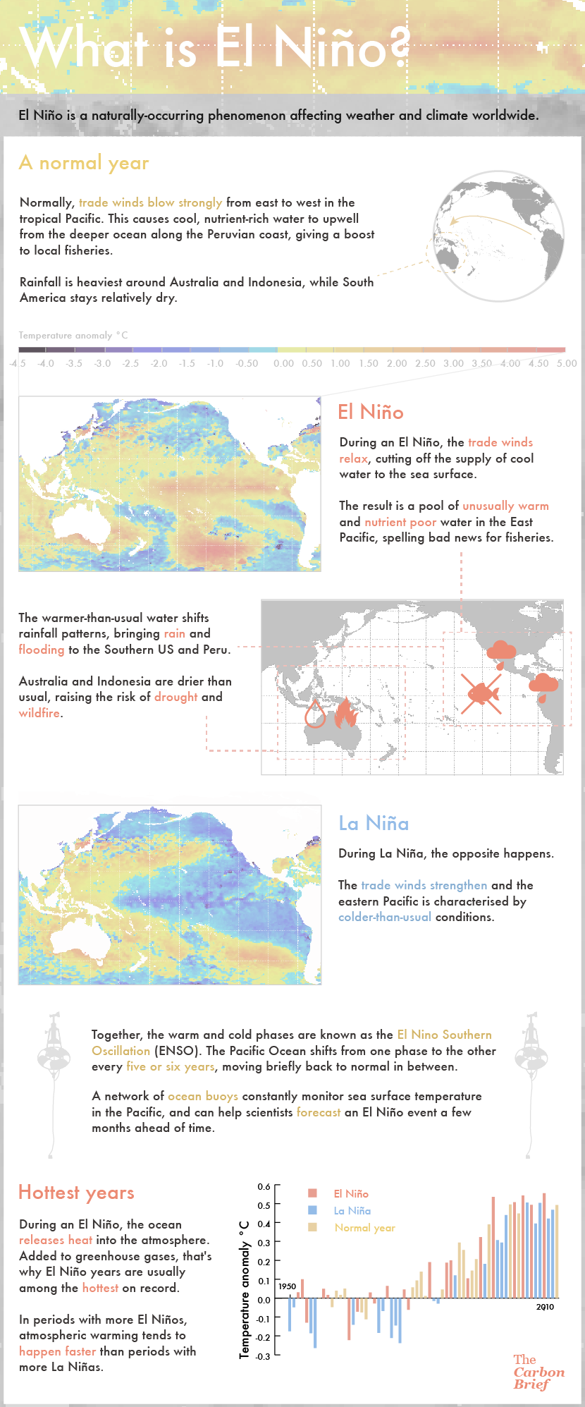
Infographic: What is El Nino? Credit: Rosamund Pearce/Carbon Brief.
The red line in the graph above shows the NASA global temperature record with the effects of El Niño and La Niñaremoved.(You can read more about themethodscientists use to do this in thisarticlefrom statistician and climate change bloggerTamino.)
Once you remove the El Niño/La Niña signal, you can see the warm peaks associated with strong El Niños in 1982/3 and 1997/8 appear less pronounced. Notably, 2016 is still thehottest year on recordby quite some margin, even once you remove the effect of thestrong El Niño.
Changes insolar activityandvolcanic eruptionscan affect global temperature, too. The yellow line in the graph above shows the same NASA global temperature record, but this time with the effects of all the major natural influences on climate – El Niño/La Niña, solar activity and volcanic eruptions – taken out.
The strong cooling effect of the Mount Pinatubo volcano eruption in 1992 is particularly visible (yellow vs red line). At the same time, however, a strong El Niño that year gave global temperature a boost, with the actual observed global temperature ending up in the middle.
Upward trend
With all the major natural influences removed, Earth’s temperature over the last few decades still shows ups and downs from year to year, albeit less pronounced ones. The fingerprint of rising greenhouse gases is, say scientists, nonetheless clear in the upward march of global surface temperature.
It’s worth noting that there are at least two othermajor global temperature datasets, including the US National Oceanic and Atmospheric Administration (NOAA) and theUK Met Office/University of East Anglia.
Both containknown data gapsin the Arctic, however. Given the Arctic iswarming fasterthan the global average, thissuggeststhat they are likely to beunderestimatingglobal temperatures.
Two groups of scientists have constructed a timeseries of the temperature in Earth’s troposphere, using data collected by satellites. Though both can tell us about climate change and the impact of El Niño/La Niña, the satellite and surface records measure very different quantities and aren’t directly comparable, as detailed in this Carbon Briefexplainer.